This document is intended to get you started with the microarray analysis platform R2
The R2 Portal
To reach the portal of R2, open your favorite browser and type this url (in the near future through the humangenetics website www.humangenetics-amc.nl):
- Type http://hgserver1.amc.nl/cgi-bin/r2/main.cgi
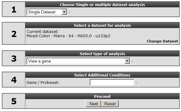
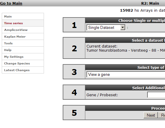
The main screen of R2 shows up: Figure 1
It is divided in three areas:On the left side there is a menu bar providing direct access to different parts of the software. To the right a news bar shows the available updates for software (in green), datasets (blue) and annotations (red). In the middle a step by step guide is shown that provides access to most analysis through a simple walktrough wizard. Whenever a lightblue “i” icon appears in R2, extra information can be obtained after one click. In this case on the selected dataset. Hovering over the grey “i “’ provides a popbox with additional information or help. In this tutorial the publicly available dataset "Mixed Colon - Marra - 64 - MAS5.0 - u133p2 will be used to explore the possibilities of R2.
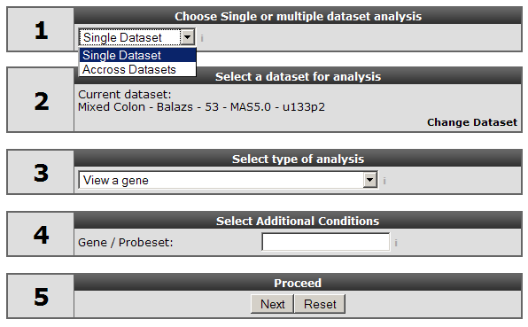
R2 can analyse gene expression for a single dataset or across more datasets. This choice can be made in step 3 of the dialog box (see fig 2):
In the dialog box step 3 (Fig 2), use the pulldown menu to select type of analysis.
- In this case we choose the single gene analysis.
- Type your gene of interest and hit next.
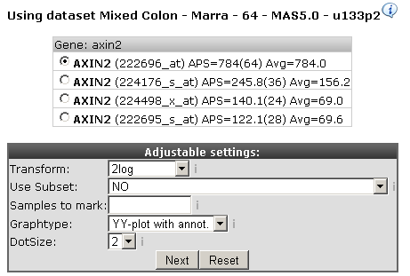
For our illustrations we took AXIN2, see figure 3. In many cases more then one probeset is reported for each gene in this case 4 probesets. The different reporters are in descending order by their average presence signal. The signal of a reporter is flagged present when according to the mas5 algorithm the reporter probeset is expressed. Automatically the probeset with the highest average signal is selected, occasionally other probesets assigned to the same gene could be of interest depending on the structure of the gene.
- Adjust the settings as in the figure
- Hit next
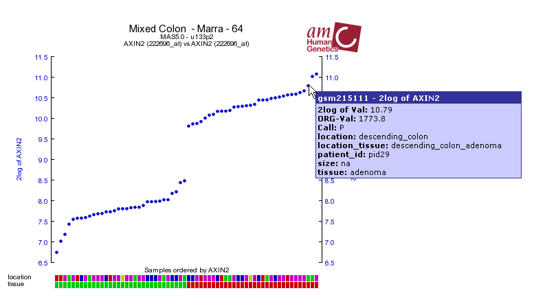
A graph will be generated from the AXIX2 gene expression (Figure 4). Each dot represents the expression of the probeset in a specific tumour, ordered by their expression from left to right. Hovering over the dots will give more information on the corresponding tumours. Under the X-axis, colored boxes are depicted, representing clinical information of the samples in so called "tracks". Again, hovering over them will reveal underlying data. For AXIN2 there is a clear relation between the expression levels and “tissue” track. So these tracks underneath the image give a quick glance at some of the clinical parameters, defined for the dataset. It is also possible to define your own custom made tracks (tutorial to be developed).
At this point you might want to try some other settings to investigate their workings and play around with some other genes. Based on the annotations you can select subsets of genes (see tutorial to be developed). For data transformation we recommend the 2log for statistical reasons (see manual). Hovering over different parts of the screen will again reveal additional information.Probeset verificationScrolling down on the same page where the AXIN2 expression graph was generated there is a probeset verification table. In order to investigate the relevance of this verification, choose another gene in the main window.
- Hit the shortcut link top left of your window: and type MBNL2.in the search box
- Hit next.
- Note the warning icon in the probeset selection box. Keep the selection as it is and hit next
- Scroll down to the probeset verification table.
This lists for the various reporters of MBNL2 whether they are in agreement with the genome position of MBNL2 reference sequence. If all are stating “YES” then everything appears alright. For the MBNL2 reporters in the middle there are multiple “NO” indications indicating there is something wrong with it.
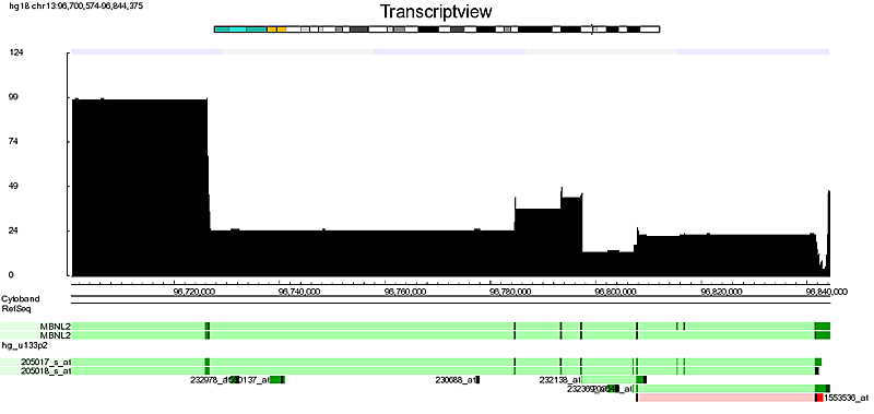
- To analyse the reporter furthermore, clicking on the “TVIEW” opens the TranscriptView application.
This program depicts the alignment of EST and mRNA sequences to the genome sequence (Fig5). It has also aligned the accession numbers used to generate the reporters on the array, this view can be viewed to inspect the quality of a reporter. Note that the reporter “1553536_at” is aligned to the genomic region of the MBNL2 reference sequence, but that it’s color is red. This indicates an alignment to the reverse complement of the genome. In some case the reporter can be positioned in the intronic (light green color ) region which also can be a reason not o pick a certain probest. NB: Currently probeset verification is only provided for various human affymetrix array types.
Two gene analysis
- Close Transcriptview and go back to the main screen
- Choose Correlate two genes
In case two genes are provided (fig: 6) the correlation of the expression values of the two genes in this data set is shown.
- Choose AXIN2 and SORD Hit next
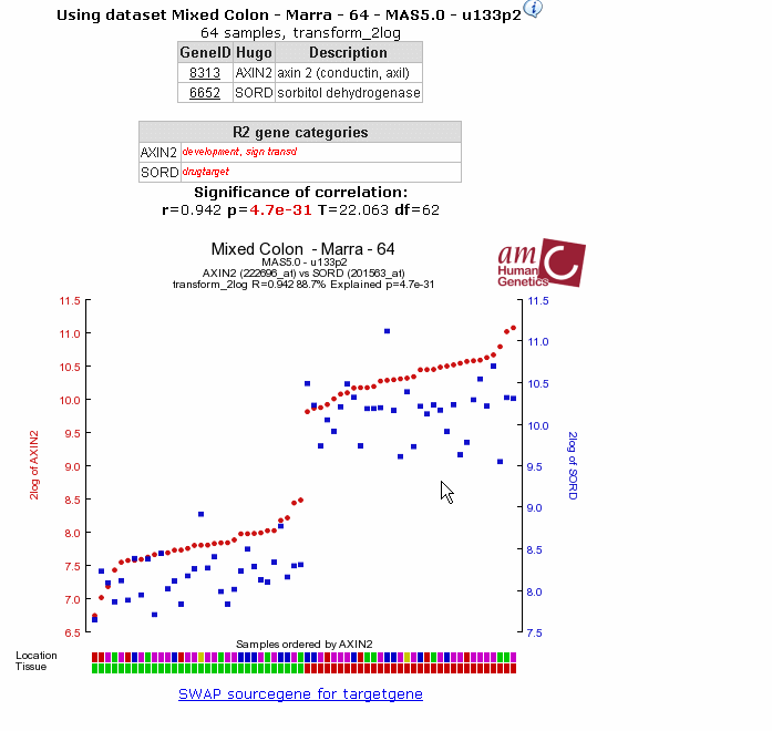
A so called Y-Y plot (Figure 7) is generated; this shows the correlation values for the expression correlation and shows this as two overlaid graphs; left axis gives expression values for the first gene, the right for the second gene (in blue). Colors etc can be adapted.
- At this point you might want to provide genes of choice to this analysis
View a gene in groups:
In R2 ‘groups’ can be created from the annotation tracks. These tracks are specific for each dataset. Personalised tracks can be generated in the menu on the left of the main screen with “my settings”. In the Marra dataset the tumours are annotated with two clinical data tracks: their position in the colon (location) and the tissue type, adenoma or normal (tissue).
- In the main screen choose “View gene in groups”
- Type AXIN2 (has a clear result, but you can take your gene of choice of course)
- Next
- Click on the "Select a track" dropdown(see Figure 8)
For dataset several combinations of the annotation are provided also.
In Figure 9 the resulting graph is shown; it is clear that there is a relation.
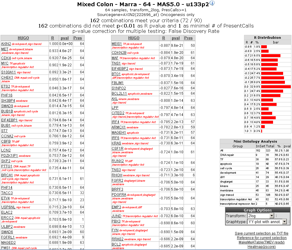
Another commonly used analysis option within R2 is to search for genes which show a correlated expression (showing a similar expression pattern as AXIN2 across the samples. At the gene selector page the prefered reporter is selected and also optional adjustments can we made to the search parameters. Normally the default settings are sufficient to perform an analysis. In this example one option is adapted a gene category , “oncogenesis” the speed up the search. This will result in the scanning for known oncogenesis genes (some 449 genes out of the 20.000 in total).
The result from the analysis will be a page containing 2 columns with hyperlinked genes, and to the right some statistics of the search. These tables report the genes which show a significant correlation with the expression of AXIN2. The left table indicating positively correlating genes, while the right table indicate negatively correlating genes. The significance for the correlations are depicted in the pval column, while the number of times the gene has been flagged with a present call is indicated in the column “pres”. In red, some gene ontology statements are added to the genes.
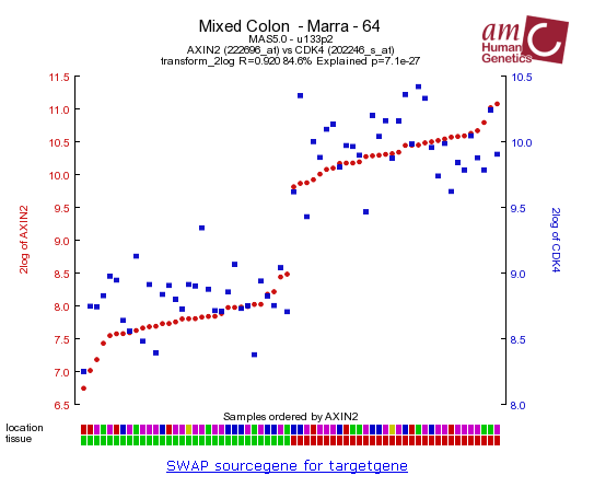
CDK4 is listed as one the genes showing a high correlation combined with a hight significance. After clicking the CDK4 gene in the left table a so called 2GeneView page is generated.
In the generated picture the AXIN2 expression is represented with red dots. However, the expressions of the second gene (in this case CDK4), has also been added to the picture in blue squares(Figure 11).
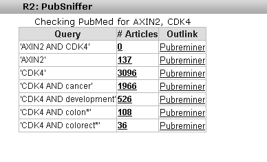
This kind of data-representtation is called a YY-plot (since both genes are are represented on the Y-axis). If 2 genes correlate with each other, then the patterns should follow each other, as is the case here. This may be a very interesting finding. We may want to know if a relation between these 2 genes has already been reported in the literature. To this end we can click on the pubsniffer link. This will query the pubmed database for the mentioning of such a relation within the titles or abstracts of published work.
- Click the Pubsniffer link
We can see that such a relation has not been published before(Figure 12).
It is also possible to see take a look at the gene expression at manipulated cell-line experiments that have already been performed. At this moment there are not many publically available timeserie datasets available. However R2 offers the option to access you timeserie experiments after consulting the R2-contact support.
A starting point for a lot of analyses is a single dataset and a gene of interest. In this tutorial the expression of the gene MYCN, a known oncogene in Neuroblastoma, is explored for correlating genes in a Neuroblastom tumor series. This same procedure is described as Search 1 in a paper by Jan Koster ea (submitted 2009)
- Go to the R2 main page
- Choose Single dataset in step 1 of the analysis wizard
- Make sure the Tumor Neuroblastoma-Versteeg-88-MAS5.0-u133p2 series is selected in step 2
- In step 3: select type of analysis, choose the Find correlated genes with a single gene
- Type MYCN in the gene field (4)
- Hit next(Figure1)
Next on screen is a selection field enabling adjustment of the tresholds for the statistical analysis (Fig2).
R2 has automatically chosen the best probeset for this gene to perform statistics with. For this analysis the default values can be kept.
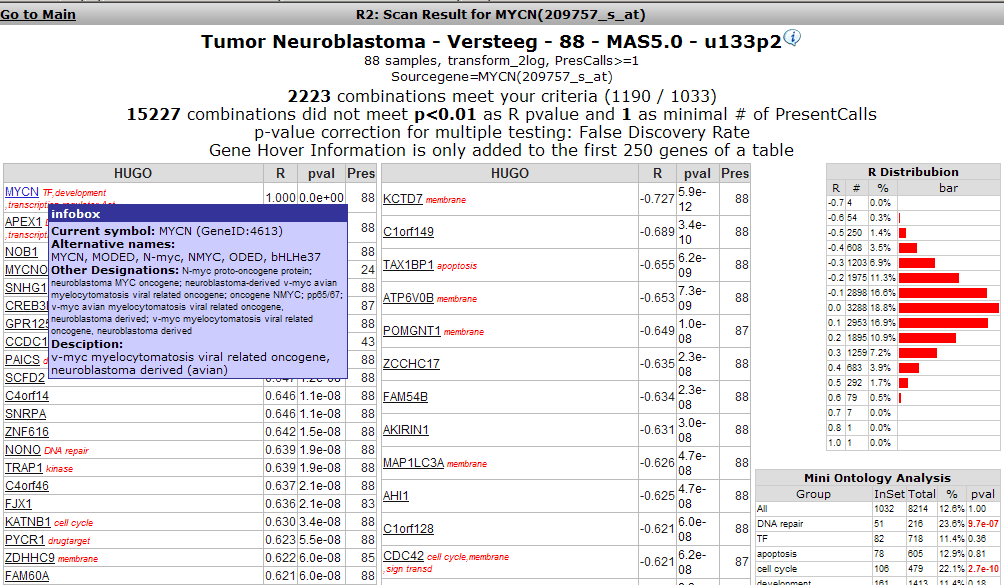
The results in figure 3 are ordered sets of positively correlating genes in the left table, and negatively correlating genes in the right table. Hovering over a gene name gives additional information about the gene, as shown for MYCN in the figure. To the right a graph shows the distribution of the probesets, in this case this has a proper bell-shape. Below that graph a short table provides a quick summary of overrepresented Gene Ontology categories. Clicking on the hyperlinked genenames will open a new browser window showing the expression values of both genes in this dataseries in a Y-Y plot.
- Lookup drugtarget PTN in the list
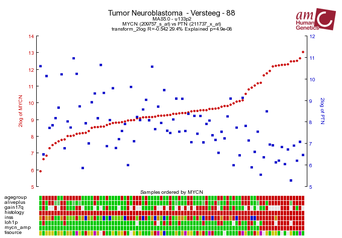
- Click the hyperlinked genename(Fig 4)
The Y-Y plot shows the correlation values for the expression as two overlaid graphs; left axis gives expression values for the first gene, the right for the second gene (in blue). They"re ordered by increasing expression for the gene of interest. Colors etc can be adapted (see ).
At this point you might want to return to the treshold selection screen (Fig2) and adapt some settings: see for example Fig 5 where a search for the genes on chromosome that are known drugtargets and are involved in the MAPK pathway is initiated.
- Try different settings and use your gene of interest
- This is the end of this tutorial
In this tutorial differentially expressed genes between groups in a dataseries are discovered. To this end a series Neuroblastoma tumors was analysed with respect to MYCN amplifications. This same procedure is described as Search 2 in a paper by Jan Koster ea (submitted 2009)
- Go to the R2 main page
- Choose Single dataset in step 1 of the analysis wizard
- Make sure the Tumor Neuroblastoma-Versteeg-88-MAS5.0-u133p2 series is selected in step 2
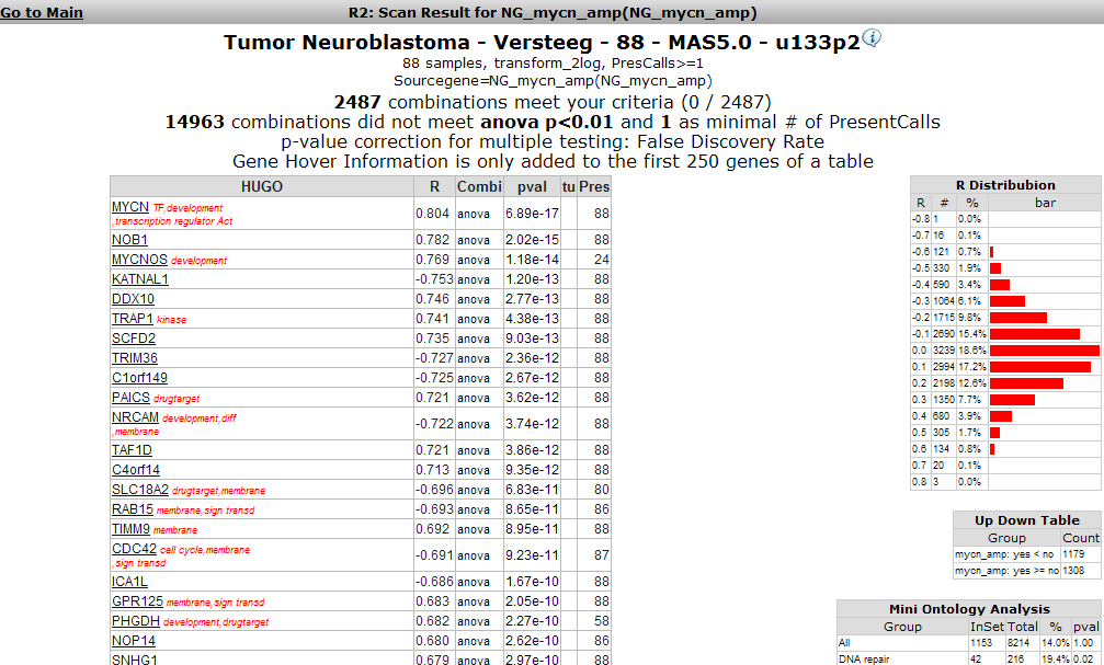
- In step 3: select type of analysis, choose the "Find differentially expressed genes between groups" option(Fig 1)
- Hit next
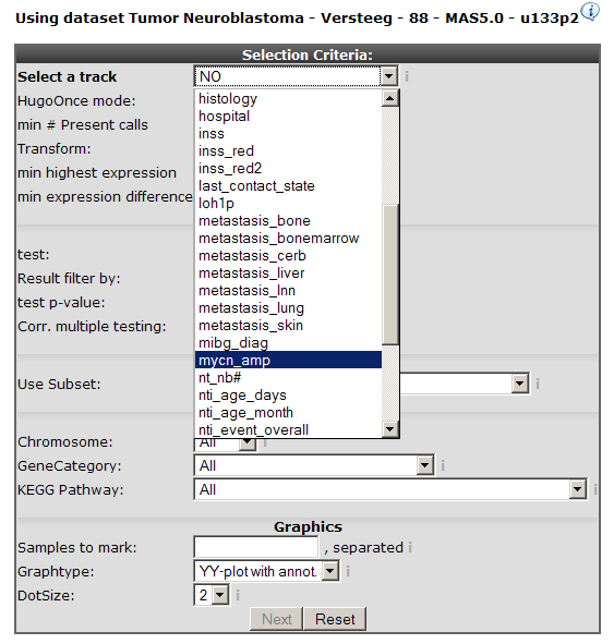
In the next screen a choice can be made which annotation "track" will be used to partion the set in groups. The Neuroblastoma series has extensive annotation; in this case the presence of a MYCN amplification is chosen (Fig 2).
As usual the rest of the adjustable fields can be left as they are: R2 provides you with a configuration appropriate for most analyses.
- Choose the mycn_amp track for partitioning in groups
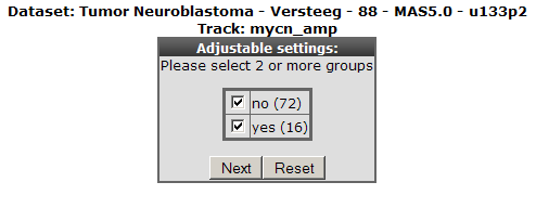
- Hit next (Fig 3)
As obvious there are only two groups to partion this dataset; other tracks like agegroups permit more choices.
- Again keep this choice
- Hit next (Fig3)
- This tutorial will show you how to find datasets were two genes of interest have a high correlations.
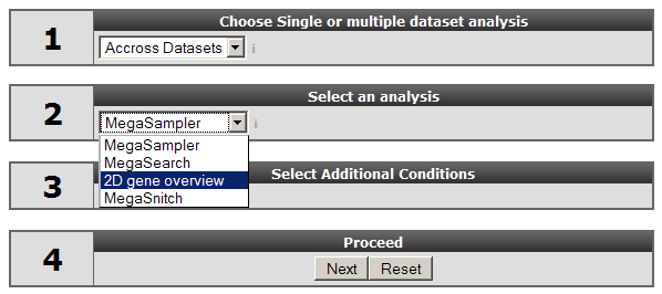
- Start with the default wizard portal (Fig 1) but choose "Accross datasets"
- Select 2DGeneView in step 3 (Fig 2)
- Type AXIN2 and SORD as genes
- Hit next
- Leave the probeset choices as given; make sure 2log is chosen as Transformation
- Hit next
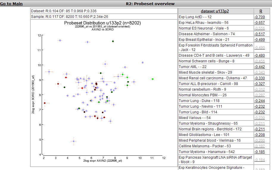
A figure will be drawn (Figure 3). The main graph shows
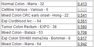
Next to it a list of datasets is given with the correlations between the two probesets in descending order; from minus to plus
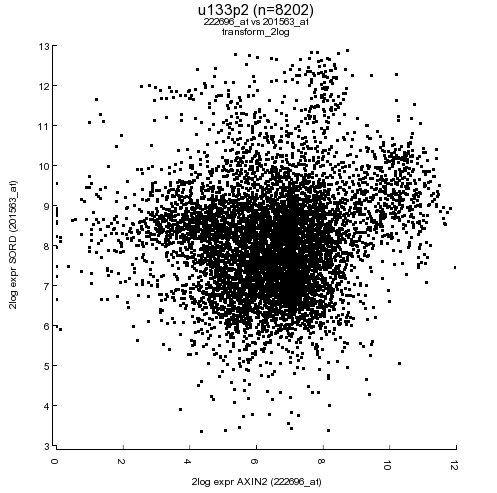
At the low end of the list you"ll find highest positively correlating datasets; fig4.
Views of the correlations can be obtained by clicking on the links; either in the table or in the graph.
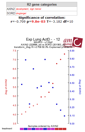
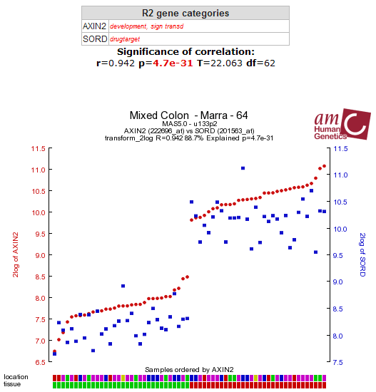
- Hit the links to the Exp-Lung (top) and the Marra (bottom of the list) links
This produces Figures 5 and 6; you find a high positive correlation between AXIN2 and SORD in the Marra set
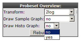
To check the statistical merits of these data you can produce some additional graphs at the bottom of the 2DGeneView panel (Fig7).
These produce a sample graph showing the distribution of all samples (Fig8)
- Set both to yes and hit Rebuild
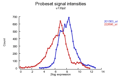
And also the histograms for distribution of the probeset values; eg for u133p2; Fig 9
Of course you can check your own genes of interest now!
- Play around with your favorite genes...
This tutorial aims to find genes regulated downstream of a manipulated gene in an in-vitro cell-line system. This same procedure is described as combined Searches 3-5 in a paper by Jan Koster ea (submitted 2009). The timeseries data analysed here are from an inducible MYCN transgene in the neuroblastoma cell-line SK-N-AS.
First a selection will be made from the series of consistently regulated genes in this series (Search 3 in the article).
- Goto the main screen of R2
- From the menu to the left select "Timeseries" (Fig1)
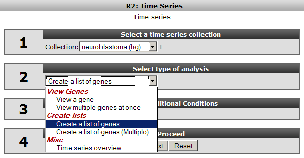
This provides access to the Timeseries Wizard: Fig2.
- In step1 select the neuroblastoma(hg) collection.
- A selection of genes is needed so select "Create a list of genes"
- Hit next
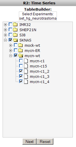
The resulting treeview (Fig3) provides you with an overview of all cell-lines that were manipulated in this dataseries. The genes manipulated show when you click on a cell-line.
- Click on SKNAS in order to expand this branch in the tree
- Select mycn-wt as manipulated gene
- Select the bottom three experiments; a triplo timeseries
- Hit next (Fig4)
The next panel allows for setting parameter tresholds to constrain your selection. Again the defaults are suitable for most analyses, however, three parameters require consideration. Firstly we want the genes to be expressed in all three experiments, secondly we take a logfold change of 0.6; this guarantees for genes having a response on the gene manipulated, and thirdly we want the single best probeset to represent a gene.
- In the panel, select 3 for the minimal number of experiments
- Type 0.6 in the best logfold field
- Set the "Force single reporter" dropdown to yes
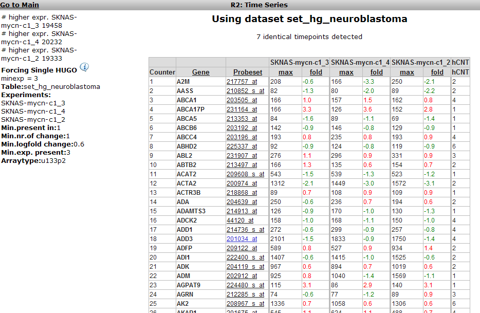
- Hit next (Fig 5)
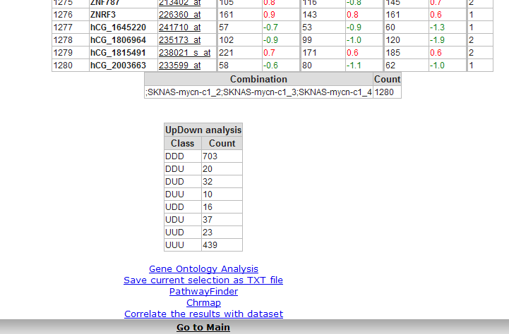
The result is a list of 1280 genes that are regulated in this set of experiments. R2 allows you to sort these lists to find most regulated genes. Scrolling down the list to the lower end shows additional analysis options(see Fig6).
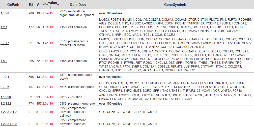
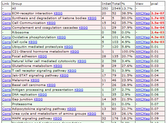
The little table at the end of the list shows the number of genes that are regulated in the same way; in this case it shows that 439 genes are consistenly upregulated, and 703 consistently down regulated. The hyperlinks in blue allow for more analyses: the Gene Ontology analysis shows the GO categories that are overrepresented in this dataset (Fig7).
The Pathwayfinder will find KEGG-pathways showing an overrepresentation of genes (Fig8).


